Introduction
The Metrics Explorer feature allows you to enter metric names or keywords and visualize a list of metric tiles, providing quick access to relevant metrics.
Other Key capabilities:
- Explore different metrics available in the client.
- Customize queries and tiles using the Tile builder.
- Add the tiles to your dashboard.
Note: This feature is available only at the client level.
Permissions
The Manage Dashboard permission is required to access the Metrics explorer.
Access the metrics explorer
Follow these steps to access the Metrics Explorer:
To select your client, click the Client/Partner dropdown from the top left corner of the Dashboards screen. Either type your client’s name in the search bar or select your client from the list.
Navigate to Infrastructure → Metrics.
The Metric Viewer screen is displayed with a metric search bar at the top.
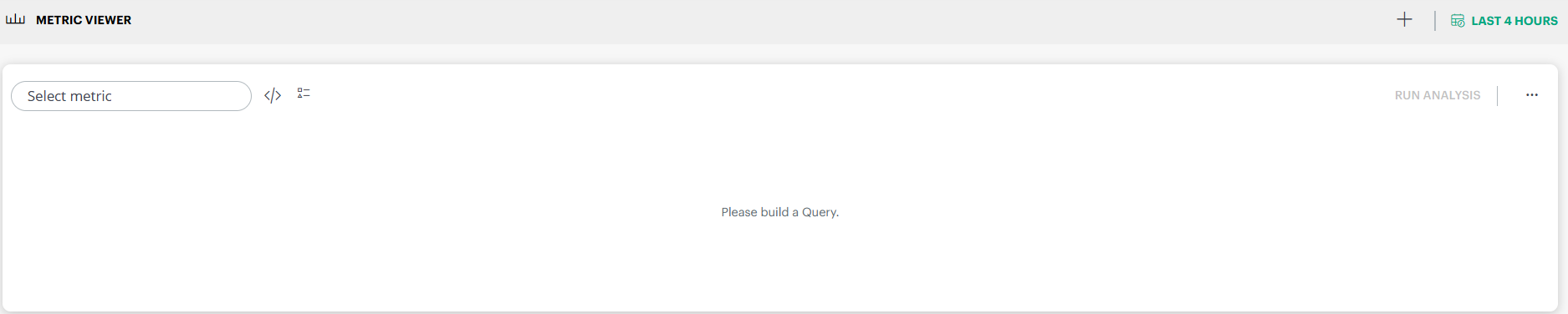
Enter a metric name or keyword in the search bar and press Enter or select a metric from the dropdown as you type.
A metric visualization is displayed.
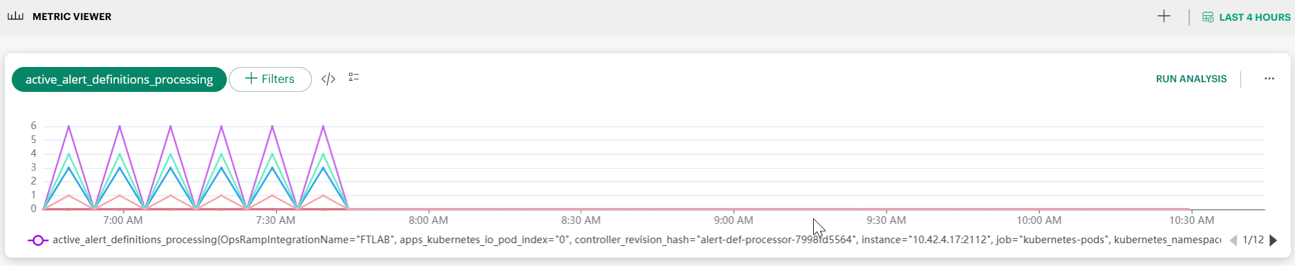
Metric Viewer
When a metric is selected, the Metric Viewer provides an interactive visualization along with additional controls:
- Displays the selected metric name.
- Use + Filters to apply label based filters (for example, integration name, namespace, instance, or other metric labels).
- Click RUN ANALYSIS to perform automated analysis on the selected metric.
- Time range selector: Available in the top right corner of the screen. Supported ranges include:
- Last Hour
- Last 4 Hours
- Last 8 Hours
- Last 24 Hours
- Last 7 Days
- Last 15 Days
- Last 30 Days
- Month to Date
- Multiple time series can be displayed within a single metric tile, each shown in a different color.
- When many series are present, the legend supports pagination to navigate across series. By default, metric tiles display data for the last hour, unless a different time range is selected.
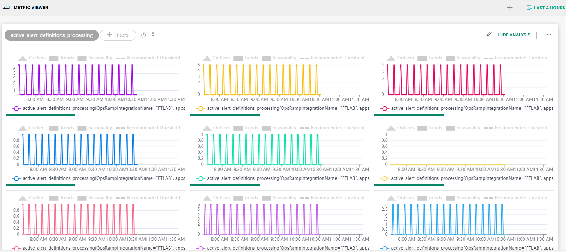
Run Analysis
When you click RUN ANALYSIS, Metrics Explorer performs an automated time‑series analysis on the selected metric and displays multiple analytical views.
Note: If the specified PromQL query returns more than 12 series, the analysis is disabled. Apply additional filters to limit the query results to 12 series or fewer.
The analysis is performed using:
- The last one month of metric data
- Data collected at 1‑minute intervals (approximately 43,200 data points)
- Any filters and time range currently selected
You can toggle the analysis view using HIDE ANALYSIS.
Analysis Parameters Explained
The following parameters are displayed as part of the analysis results.
Outliers (Anomalies)
Outliers represent data points that significantly deviate from normal behavior.
- Detected using adaptive anomaly detection based on metric volatility.
- Calculated using one month of historical data.
- Missing values are interpolated to ensure continuity (up to 20% missing data is supported).
- Values exceeding the calculated threshold are marked as outliers.
Limitations: Outlier detection may not produce meaningful results for:
- Constant data
- Monotonically increasing data
- Monotonically decreasing data
Trends
The trend indicates the overall direction of the metric over time.
- Calculated using one month of historical data.
- Shows whether the metric is generally:
- Increasing
- Decreasing
- Stable (flat)
A flat trend indicates the metric is largely stable without significant directional change.
Seasonality
Seasonality identifies repeating patterns in metric behavior.
- Detected using a one month analysis window.
- Supports identification of patterns with up to weekly periodicity.
If no seasonality is shown, the metric does not exhibit consistent repeating behavior within the analysis window.
Recommended Threshold
The recommended threshold is a system generated anomaly threshold derived from historical behavior.
- Calculated using volatility analysis combined with a clustering algorithm.
- Values above this threshold are considered potential anomalies.
- Provided as advisory guidance for further investigation or alert configuration.
Note: Automatic alert generation based on adaptive thresholds is not enabled yet and will be introduced in a future release.
Additional Analysis Notes
- Maximum series supported: Up to 12 time series per metric query.
- Missing data visualization: Even though missing values are interpolated for analysis, gaps may still appear in charts where original data was unavailable.
- Volatility limits: If metric values are constant, volatility and threshold calculations may return null.
Add to dashboard
The Add to dashboard functionality allows you to add tiles to a dashboard.
Follow these steps to add a tile to dashboard:
To select your client, click the Client/Partner dropdown from the top-left corner of the dashboards screen. Either type your client’s name in the search bar or select your client from the list.
Click the Search icon in the upper-right corner of the screen.
The METRIC search bar is displayed.
Enter a metric name in the dropdown and press Enter, or enter a search string and select a metric from the dropdown. The search result is displayed.
Hover over the tile. The + (Add to dashboard) icon is displayed.
Click + and select a dashboard from the Dashboard dropdown.

Click ADD TILE. The tile is added to the dashboard and a confirmation message appears.
Verification: To verify whether the tile has been added to the dashboard:
- Click Dashboards menu → Dashboard.
- From the Dashboards screen, click the hamburger menu.
- Select the dashboard where you added the tile. The metric tile is displayed.

Customize a tile
The Customize option allows you to customize a metric tile.
Follow these steps to customize a tile:
To select your client, click the Client/Partner dropdown from the top-left corner of the dashboards screen. Either type your client’s name in the search bar or select your client from the list.
Click the Search icon in the upper-right corner of the screen.
The METRIC search bar is displayed.
Enter a metric name in the dropdown and press Enter, or enter a search string and select a metric from the dropdown. The search result is displayed.
Hover over the metric tile. The CUSTOMIZE option is displayed.

Click CUSTOMIZE. The Tile builder screen is displayed.

Modify the query, add more queries, or change the visualization of the metric tile.
See Metric Tile for more information on how to build queries and customize the visualization.Click ADD TO DASHBOARD.
Select a dashboard from the dropdown and click ADD TILE. The tile is added to the dashboard and a confirmation message appears.